FWD:labs

Blog

  • Published in Film + Web

Camera prep for the spot. Photo via Volvo Trucks.

Camera prep for the spot. Photo via Volvo Trucks.

“The Epic Split” is one of several stunt-based ads from Volvo Trucks, the first of which to include Jean-Claude Van Damme. Aside from this classic stunt for which he is known, Van Damme, 53, is there to plug the vehicle’s highly precise steering feature, presumably when driving both forwards or backwards.

How did they do it? Shot in one take after three days of prep, this spot was shot in a 15 minute span of morning daylight at Ciudad Real, a vacant airfield in Spain.

Client: Volvo Trucks
Agency: Forsman Bodenfors
Production Company: Folke Film, Stockholm
Producer: Joi Persson
Stunt Coordinator: Peter Pedrero
Production Service Company: Story We Produce, Barcelona
Producers: Ana Laura Solis and Marc Bedia
Director: Andreas Nilsson

I was curious if they shot it backwards for the sake of ease. Despite the marketing material touting these trucks drove backwards, some comments on YouTube wondered about the same thing.

Here’s a copy of playback in reverse intentionally without audio:

van-damme-volvo

Today, one day after the online release in what appears to be an exclusive for them (versus bland repeats of the press release), the Wall Street Journal cleared this up, quoting Anders Vilhelmsson, public relations manager for the Volvo Trucks brand. “The stunt is real and is performed in just one take. … It’s a daring stunt but we had full control. There was never any real danger involved.” It goes on to say that the actor, known also as the “Muscles from Brussels,” is actually not on the side mirrors but a small platform, plus a safety line to ensure he wouldn’t be hurt.

The trucks go backward in the video because “we all know that going in reverse is a bit more difficult than going forward,” Vilhelmsson said. “We felt that would be the ultimate test, to have the trucks go in reverse with someone standing on the side mirrors performing a side split. And we knew that if anyone would be able to do that, it would have to be Jean-Claude Van Damme.”

Even with those precautions, well done.


Author

Aaron Proctor
Founder, FWD:labs
Director of Photography site
Contact


bob-odenkirk-breaking-bad

As followers of The Story Source know, I’ve written extensively about Breaking Bad, the Emmy award-winning show on AMC that wrapped its final season a few weeks ago. But I’m not here to praise the expert storytelling (ten Emmy awards), the suspenseful scenes (too many to name) or even the superb direction (Vince Gilligan is among the best in the business).

I’m here to talk about Saul Goodman.

Saul, played by the multi-talented Bob Odenkirk, is one of the funniest and fully developed secondary characters on television. After watching him for five seasons, I’ve fallen in love with Saul’s flagrant scheming and naked opportunism. But what exactly makes Saul so memorable?

It all comes down to character choices.

To help you tell stories with characters that are as colorful and rich as Saul, here are “3 More Tips on Creating Great Characters.” Follow these tips and you may have a spinoff show in your future.

  1. Simplify Your Descriptions. In real life, people are complex, full of nuance and subtlety. Unfortunately, when you tell a story, you only have a limited time to showcase secondary characters, so make your descriptions count. To do this, simply answer the question: Does the description paint a picture of the character for the audience? If the answer is no, make sure to add the necessary visuals to make the description pop out to a listener or reader.
  2. Use Metaphors and Analogies. In some instances, it can difficult to reduce whole characters to simple descriptions. This is where the right metaphor or analogy can help. For example, maybe your brother-in-law is a police officer with a buzz cut who sings songs from Michael Jackson’s “Thriller” in public places (go with it). One possible analogy is that your brother-in-law is like the child of Joe Friday and Lady Gaga. Another possible metaphor is that he’s a mix of the Hardy Boys and Fallout Boy. The key to finding the right metaphor or analogy for a character is to identify the unusual or prominent thing about the character and then offer a truthful comparison. Even if the analogy doesn’t get a huge laugh, it will at least resonate with the audience. Just remember: analogies should be used to augment descriptions, not to replace them.
  3. Serve The Plot. Once you’ve boiled down your characterizations and/or added an analogy, the final step in the process is to make sure that your character descriptions serve the story’s plot. For example, if you mention that your father used to shoot rabbits at the beginning of the story, the audience is expecting a reference to either guns or rabbits somewhere later in the story. If you don’t deliver on this promise, they’ll begin to wonder why you chose the original description. Once again, deliver what you promise! The upside of doing this is that it’s also an easy way to inject humor into your stories.

Feeling better about your characters?

(Originally posted at The Story Source.)


Andrew Linderman
Writer. Teacher. Consultant.
@lindermania


Part of a series of posts about great film, web, or design artists and their work abuzz online and in-person.
UN Women "Women Need To..." ad by Ogilvy & Mather Dubai

UN Women "Women Need To…" ad by Ogilvy & Mather Dubai


Author

Aaron Proctor
Founder, FWD:labs
Director of Photography site
Contact


  • Published in Film

lauren

A lot of people have asked my opinion on the lack of female cinematographers in the industry. It’s something I’ve mulled over for a while. And while I think the film industry has it’s own unique problems regarding sexism in both the content it produces and its treatment of its own working members, it stems from something deeper set in our society.

Freja Dam, a student from the Columbia Journalism School, recently wrote me to ask me questions on this subject for an article she is researching. She found me because my blog pops up immediately when you google “female cinematographers.” (Hooray for me! That is the purpose of my blog! To continually ask the question WHY IS MY DINKY BLOG THE FIRST THING THAT POPS UP?! I will continue to point out how silly this is until Ellen Kuras is the top google result.)

Anyways, she asked me some pretty great questions. I wrote out my response and asked a few friends to weigh in. It was a pretty solid consensus. So I wanted to post my thoughts as well. Here was my email in full, with Freja’s questions in bold.

(And before I get any gripes, here are my previously published thoughts on the totally unnecessary term that is “female cinematographer.”)

#

Do you think it’s women who for whatever reason choose not to pursue cinematography, or are they driven away because they don’t get hired?

I think cinematography is presented as intimidating, and there is a severe lack of encouragement to pursue it.

Just getting in to the field of cinematography is incredibly daunting on its own, and there isn’t a lot of encouragement directed specifically toward women to join. If you look at the American Society of Cinematographers, as of last year I believe there was only around 8 women out of over 300 members. Not sure if that has changed much since. I know a lot of women find my blog because they can’t find any other resource online that addresses the issue (which is mind boggling to me. I started writing about this on a whim!) Most of the articles I find that interview a female DP don’t ask them about their work, but things like “how do you keep your femininity in tact on set?” They describe the clothes they are wearing, or their hair. Just once I’d like to see an interview when they ask a woman DP what lenses she used. We need to stop telling these women their femaleness trumps their actual work.

From all sides women are often told that cinematography is a dude thing. It’s too technical, the equipment is too heavy, you wouldn’t like the brutal hours, it’s a guys club, you won’t have time for a family or romantic relationships. One of my readers wrote to me and described how she was told by the man giving the entrance exam to the film school she wanted to attend that she wouldn’t make it in because “women get too emotional during that time of the month” and couldn’t handle themselves on set.

And it doesn’t help that working female DP’s aren’t very well known or celebrated. Who is telling these women that “she did it, so you can do it too?” Ellen Kuras, Nancy Schreiber, Anette Haellmigk, Mandy Walker– they all do very high-profile work with celebrated directors, but no one knows who they are.

Once women do make the choice to pursue camera work, they often find themselves in a hostile environment. I remember a friend of mine, when I told him I wanted to DP, looked worried. He said, “All the women I know who got into that field ended up really hardened and callous. It’s brutal.”

I definitely think more female DP’s need to be hired, and more women need to be in camera in general. Set a new precedent. A lot of female cinematographers are out there, working and slogging through the bullcrap. It’s the only way to show both men and women it can be done differently. The whole climate has to change.

Is the film business just sexist, or is there some specific characteristic about cinematography (I heard an argument that the cameras are heavy, and it’s very technical) that either drives women away or keeps (male) producers/directors from hiring them?

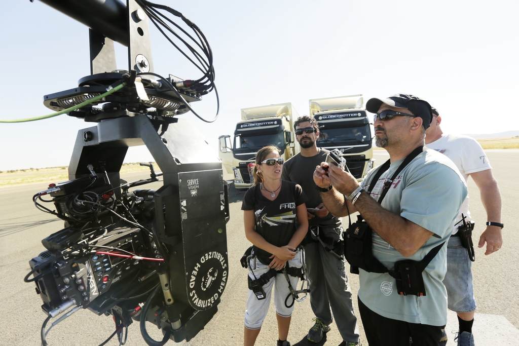
Camera department for women definitely is distinct when compared to the climate in other departments. The boys club mentality is still reigning strong, using the physical, technical, and leadership aspects of the job as reasons to keep it that way.

When it comes down to it, men feel a lot more comfortable with hiring other men in regards to camera. I can’t remember of the top of my head, but someone in an interview once said something to the effect that “Men [in the industry] are considered competent until proven otherwise; women are seen as incompetent until proven otherwise.” Edit: it was DP Claudia Raschke who said, “When you go to an interview or onto a set, as a woman you are incompetent until you prove you know your stuff. As a man, you are considered competent until you are proven totally incompetent. We’re not given the same chance because we don’t have a track record yet.” We are not given the benefit of the doubt like men are, and somehow we are considered more of a risk– and it’s our technical and leadership skills that are questioned.

Will an all-male G&E department listen to a female DP? Can she command respect? Does she know her stuff? Does she know the technology? If she’s my boss, will she be a bitch? Do I have to be on good “behavior”? Can she handle the high pressure and long hours without getting emotional?

Another reader of mine wrote me in frustration about how she was told by a producer she was very much qualified for a job, but they had to pass on hiring her because having a girl there would basically “ruin the fun” and they’d have to pay to get another hotel room for her. In an ironic reversal of that, I was actually brought on to a job once because “having a girl around might make them behave better.”

A common thing I am asked by women who read my blog is how to be less intimidated by the technical stuff. Being surrounded by dudes talking shop all the time can be overwhelming and even numbing. I don’t get particularly excited by tech specs myself. It’s what I can do with them that gets my brain working. I think having other women around to talk camera would help aspiring DP’s immensely– it would make them feel less isolated and more confident. It would widen the conversation.

A friend of mine added that it doesn’t help that women aren’t encouraged to pursue technical careers in general, starting even at a young age.

As to the heavy equipment thing… I am not sure how often Roger Deakins or Janusz Kaminski actually carry their own equipment around aside from operating. My male and female friends work out to keep themselves in shape for operating. It’s not that hard.

Why do you think it’s harder for women to break through as a cinematographer as opposed to a director/producer/editor?

Basically what I mentioned above: it’s a harder boy’s club to break into. It’s more intimidating technologically, and harder to prove yourself. Female DP’s are less celebrated and less praised for their work. Directors I think experience a lot of the same things– namely being questioned about their ability to lead. Somehow the industry will trust a woman to produce an entire film and handle millions of dollars, but they get weirded out by putting a camera in her hands.

One of the most asked questions I get on set is, “Do you eventually want to be an actress?” I find it bizarre. My editor friends haven’t been asked this. My male DP friends have never been asked if they eventually want to act. Is a woman behind the camera really that startling?

What’s your experience?

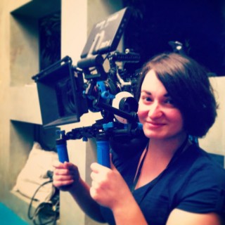
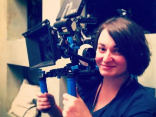
The reason I got into cinematography was because it intimidated me. I saw those film cameras at school and decided I wasn’t going to be afraid of accidentally breaking them. I wanted to know how they worked. And I totally fell in love with them. It’s still scary at times. But cinematography and camera really fuel how my brain works. It’s how I tell stories.

I was really lucky when I was in school and even now, working with supportive professors (including ASC member Judy Irola) and friends and colleagues that don’t think twice about handing me a camera. I get to work on projects I really care about. Of course, getting out into the field gave me enough “adventures in sexism” to start really thinking hard about women’s place behind the camera. That’s why my blog started leaning in that direction. I want to help other women avoid the fear that I had. The industry is ready for change.

I learned cinematography through lighting for actual film, and still often prefer it sometimes- but digital is giving us so many new ways to tell stories, and it’s an incredibly exciting time to be in camera. I don’t want women to miss out on that.

I work primarily shooting short films, music videos, and working with Youtubers like Freddie Wong and Rocketjump, producing web content and shows.

Why is it important to have female cinematographers, and what do you think is the goal – 50/50?

Right now one of the big debates going around Hollywood is whether or not female stories can bring in audiences. It has been proven time and time again that they do, but somehow Hollywood keeps asking, “Really? Can they really bring people in?”  At the same time, we have male writers, directors, and creatives making the female-driven movies (and all the male-driven movies) that we actually do have. This seems ridiculous to me.

Why are female cinematographers important? The same reason female writers and directors and editors are: cinematographers are storytellers. Through all that technology and equipment, they are telling a story. They bring their own style, story and perspective to their work. They know the characters as deeply as the director, the meaning behind each scene and what it means for the light and the frame. To shut women out of that field would be a profound loss for the film community and movie goers.

Having more female cinematographers will also bring more women behind the camera. Encourage more women to see a career in cinematography as something attainable, interesting and worthwhile. It will help change the weird stigmas that still exist on set. It will make more inclusive, diverse communities and thus better storytellers.

50/50 would be incredible. Right now though, numbers aside, I think the real challenge we face is being seen as “cinematographers” and not “female cinematographers.” I advertise my blog that way in order to draw attention to the disparity. But the goal is to make women as cinematographers the norm, not the exception. That’s when the numbers will fix themselves.

(Originally published at I Should Write This Down.)


Lauren Haroutunian
Cinematographer
I Should Write This Down
@laurasaurusrex


chipotle-scarecrow-1

A few weeks ago, Mexican fast-food giant Chipotle released a semi-informational meets borderline PSA ad called “The Scarecrow” that quickly became viral. Created in conjunction with Academy Award-winning company Moonbot Studios, the ad in the end seeks to promote a mobile game, which – according to Chipotle’s own creators — promotes sustainable farming.

https://www.youtube.com/watch?v=lUtnas5ScSE

This breathtaking use of animation tells the story of a scarecrow who works for “Crow Foods,” a fictitious company selling “100% beef-ish” products, plumping chickens with mysterious substances, and housing cows in tiny cramped crates.  As he grapples with the realities of the food being mass produced for children and adults, he comes to the conclusion that there is a better way, eventually using his home-grown vegetables to create something better.

While some might applaud the investment in an eye-capturing, entertaining use of digital media in an online platform, not everyone was ready to embrace Chipotle for taking a stand. The website Funny or Die released a parody ad, calling Chipotle out for using manipulation and guilt to sell their product, a critique that was reiterated by a slew of websites including The Washington Post and Mother Jones.

But so what if, at the end of the day, Chipotle was hoping to sell a few more burritos while they were at it? Is that so bad? As a for-profit business, that is their end-goal.

chipotle-scarecrow-2

Is it so hard to accept that a company founded to compete in a capitalistic society might be willing to use their name recognition to promote a message of sustainability? Sure, it’s hard to argue against those who claim fear and guilt were the tactics used to promote this message, but in a culture where it’s so easy to justify away a problem, or close a web browser when confronted with a message that is less than ideal, it stands to reason that sometimes we need to be shaken up to pay attention and care.

Should we really be attacking a company for not being “perfect” in their use of non-GMO, sustainable food? Or should we applaud the effort at a time when other companies make billions selling hamburgers made from over 60 different ingredients (to say nothing of what exactly these ingredients might be).

This ad is un-traditional. It uses a narrative format to start a conversation and evoke an emotional response. Remember the Old Spice ads a few years back that featured the company’s spokesmodel speaking directly to viewers and their girlfriends? Same concept.  Instead of presenting a slew of facts that get you to run out the door and buy a product, these ads encourage thought and dialogue, and communicate what a brand stands for. (For more on the nerdy details on the advertising implications of this video, check out the Forbes article.)

chipotle-scarecrow-3

At the end of the day, whether you take this ad for just that — an ad — or jump on the chance to form a strong opinion on the morality of this advertising choice, one thing is certain: we have witnessed the intersection of art, social activism, and capitalism to create an ad that rises to a higher level of cleverness; a pairing that is sure to encourage engagement and investment from those who might otherwise have turned a blind eye.  And at the end of the day, isn’t that the purpose of all good art?


Author

Courtney Robertson
Non-Profit Arts Administrator
@quartersmarie


Lens flares in daylight, looking all the more realistic

Lens flares in daylight, looking all the more realistic

More and more, video games mimic film as a collaborative storytelling business. This cinematic realism is effective for video games as seen by the profits. Take a look at Grand Theft Auto V, the latest in the controversial yet consistently pushing-the-limits series whose first week profits rival that of blockbuster films. It uniquely sports 3 heroes with mostly * interchangeable storylines that cross each other, but — unlike a linear film’s layered narrative — grants players a giant map to explore, all with story- or curiosity-driven efforts to keep you entertained. (* If you’re wanted by police, or on a story mission, you can’t switch it up, notes one wiki for GTA5.)

Classic hero shot for the antagonist you can play in the game, Trevor Phillips

Hero shot for antagonist Trevor Phillips, 1 of 3 playable characters

According to the Metacritic’s Game of the Year amalgamation of reviews, over the last 5 years, four of the five are narrative-driven stories: “The Walking Dead” (2012), “Batman: Arkham City” (2011), “Uncharted 2: Among Thieves” (2009), “Grand Theft Auto IV” (2008). Coincidence or a sign of the increasing cross-over with film as applicable?

In terms of overall production, video game labels consistently now pull over storytellers; utilize voice talent and actor motion capture; articulate cinematic angles and lens artifacts; stitch orchestral music cues and foley sounds; and push digital animators and programmers toward the interactive medium.

Game development can cost upwards of $15 million, and games tend to sell around $50 each when reaching consumers. While games are consistently a higher price tag, it’s no $10-15 movie-going experience, providing many more hours of game time narrative in trade for real, face-to-face actors, locations, and production.

There’s also a long shelf life for each game console’s edition, much like DVDs and now Blu-rays discs for films; backwards compatibility only sometimes exists. There’s also a slightly stronger ability to prevent piracy versus video disc media, but part of that has to do with being locked in to having a gaming console (unless you opt to hack your own emulator, of course).

Very specific perspectives provide information across the frame

Very specific perspectives provide information across the frame

While sports and puzzle games still make for popular video games, even open world games have a narrative mission, and only multiplayer gaming is unique, unlike no linear film. In Grand Theft Auto V, as noted in IGN’s review, driving your ATV too close to a group of hikers might even yield a response — “Typical!” — which likens to a directed, scripted effort, not a programmer’s Easter Egg (such as spotting Bigfoot from a helicopter, collecting Illuminati treasures, and UFO sightings that are hidden in the game).

From the Los Angeles Times:

The $1-billion retail milestone would rank “Grand Theft Auto V” alongside Hollywood’s top box office performers for the year, including Walt Disney Studio’s and Marvel Entertainment’s “Iron Man 3” and Universal Pictures’ “Despicable Me 2.”

Lower framing adds a subtle touch

Lower framing adds a subtle touch

From BusinessWeek, which notes how Rockstar Games spent $125 million to develop, $150 million to market, and it’s not even for a next-gen system. The game is for the 8-year old Playstation 3 and Xbox 360 platforms:

In part, the decision to build for the old consoles is driven by the fact that game developers have gotten really good at it. Aaron Garbut, the art director at Rockstar North, told BuzzFeed that the studio is just hitting its stride when it comes to using the capabilities of the current consoles to do things like replicate convincing-looking daylight. Dan Houser, co-founder of Rockstar Games, told Famitsu magazine that the best games for a console always come out at the moment before it’s overtaken by newer machines:

The fact that hardware’s so mature right now is exactly why we’re able to go on to the next level. GTA 4 was our first attempt at a new platform and HD visuals, so the first part of development was seriously difficult. Now we know what the hardware’s capable of, so it’s become a lot easier to move things along and a lot more fun, too.

Will the interactive nature of video games continue to push the envelope of immersive alternatives to traditional narrative entertainment, or will the high production value of film still triumph?


Author

Aaron Proctor
Founder, FWD:labs
Director of Photography site
Contact


the-social-network

Earlier this year, I attended a pitch event for young entrepreneurs seeking funding for their start-ups. The room was packed with over 200 business people and there was a buzz in the air. But two minutes into the first powerpoint presentation, things began to shift. Spectators started to squirm. A few of the panelists sank back in their chairs and checked their watches. Within ten minutes, eyes were glazing over as the unlucky presenter droned on.

Does this situation sound familiar?

Luckily, there’s an easy fix for a dull pitch: tell a story.

To help you pitch a product or sell an idea more effectively, here are “5 Rules for Telling Stories with Your Pitch”. Follow these guidelines and you’ll have investors throwing money at you before you know it.

1. Make Your Opening Count. It’s important to start your presentation off with a a bang, so make your first few lines memorable. Your first lines should establish (a) the problem you intend to address with your idea or product; (b) the characters, or players, in your world; and (c) a hint at the solution, or where you’re going. Paint a picture for your audience!

2. Be Vulnerable. Investors are not expecting everything to be perfect – if everything was perfect, you wouldn’t need help – so be open to sharing challenges. The easiest way to do this is to talk about what happened in the process of growing your business. What obstacles did you face? Remember: don’t pass judgement on yourself or your customers. It’s better to open up about that something didn’t work during your pitch than have it come out in a Q&A. Your audience will thank you for it.

3. Build Tension. As I’ve discussed before, the way to build tension in a pitch is by identifying the emotional arc of the talk. Pitches, like stories, are about the subtle changes in one of the five essential emotions (fear, love, anger, sadness and joy). What happened to you along the way? Did you start the business confused and wind up feeling excited? Maybe you felt confident and now feel frustrated? Once you know the emotional arc of the pitch, your job is to take the audience on the journey. Show us what happened and your audience will begin to care about you and the product or idea.

4. Revisit Your Value Proposition. The best pitches are organized around a central idea, or theme. In business, the central idea is known as the value proposition. One quick way to identify the value proposition is the answer to the question: why should a customer buy this product or service? Use the answer to this question (i.e. to have easy access to the world’s information online), to segue into your vision for the future.Show people how things will change in the world you’re creating with your product or idea.

5. Have a Clear Call To Action. Once you’ve taken your audience on an emotional journey and they know your value proposition, the last piece is having a call to action. A good call to action will give your audience something to do with the information you’re imparting. Do you need $1.725 million for capital equipment? Six additional staffers for a new team? The key here is to be specific about what you want and ask for it. The more specific you are, the easier it will be for investors to understand your needs and give you what you want.

Not so bad after all, right? Now you’ll just have to figure out how to deal with Aaron Sorkin when he wants to make a movie about your life.

(Originally posted at The Story Source.)


Andrew Linderman
Writer. Teacher. Consultant.
@lindermania


  • Published in Film + Web

Kevin Spacey on the future of television - video. Photo via ITN / The Guardian.

Kevin Spacey on the future of television – video. Photo via The Guardian.

Kevin Spacey recently delivered the James MacTaggart Memorial Lecture, a main event of the Edinburgh International Television Festival dedicated to the writer/director namesake as well as polemic issues in the industry. In addition to curbing piracy, Spacey believes releasing content online will be a win-win for both networks and audiences.

And the audience has spoken: they want stories. They’re dying for them. They are rooting for us to give them the right thing. And they will talk about it, binge on it, carry it with them on the bus and to the hairdresser, force it on their friends, tweet, blog, Facebook, make fan pages, silly GIFs and god knows what else about it, engage with it with a passion and an intimacy that a blockbuster movie could only dream of. All we have to do is give it to them. The prize fruit is right there. Shinier and juicier than it has ever been before. So it will be all the more shame on each and every one of us if we don’t reach out and seize it.

Check out the entire transcript by Telegraph.co.uk.


Author

Aaron Proctor
Founder, FWD:labs
Director of Photography site
Contact


"Orange Is the New Black." Image courtesy of Netflix.

“Orange Is the New Black.” Image courtesy of Netflix.

A few nights ago, as I was drifting off to sleep, I started watching the first season of the hit show Orange is the New Black from Emmy-award winning producer Jenji Kohan. As the credits began to roll, I heard the opening song (“I’ll Take You There,” by the Staple Sisters), and then something unusual happened.

I was glued to the screen. For hours.

When I was done watching (my internet connection abruptly died, or I would have binge watched all night), I started thinking: How does Kohan tell such a compelling story?

The answer, I quickly realized, is pretty straightforward: it comes down to a few simple rules.

To help you tell your own stories as well as Kohan, here are “3 Storytelling Rules to Follow.” Keep these in mind when developing your own stories and you may have the Emmy committee calling you before you know it.

  1. Start with a big opening. I’ve mentioned this point in previous posts, but it bares repeating again. The audience has a short attention span, which means that it’s the job of the storyteller to draw the audience in right away. The easiest way to do this is to raise questions in the opening of the story. In the first scene of Orange is the New Black, for example, we see a series of shots of people bathing, followed by a shot of two women caressing in a warm shower. The camera then abruptly cuts to a scene of the protagonist, a pretty young blonde woman, shivering under a prison shower while another woman yells at her to finish. Gripping and a bit confusing, right? Start your story with a splash (sorry!) and your audience will follow you wherever you go.
  2. Make sure every scene serves a purpose. Each scene in your story should serve a purpose. There are a number of different functions for scenes: demonstrating the setting, showing character, establishing the problem, showing the stakes, developing tension, heightening conflict, and providing comic/dramatic relief. The best scenes do at least one of these things, if not more. The more layered the scenes, the richer the story will become.
  3. Deliver on what you promise. A good story is a promise: in exchange for the audience’s attention, you (the storyteller) promise to answer the following question: How does the main character resolve the central problem he/she confronts in the story? If the opening of a story raises questions and sets the audience’s expectations about what’s going to happen (see #1), the ending should answer these same questions. In Orange is the New Black, for example, the opening raises the questions: Why is the main character in prison? How did she get there? And what happens to her in the shower? We find out all of these things in the course of the pilot (SPOILER ALERT: smuggling drugs, turned herself in, and not getting clean). By the end of the episode, the audience feels satisfied because the questions have been answered and new, more nuanced questions have been raised for the next episode. That’s why audiences keep tuning in season after season and year after year.

(Originally posted at The Story Source.)


Andrew Linderman
Writer. Teacher. Consultant.
@lindermania


DreamWorks Animation's TURBO

DreamWorks Animation’s TURBO

Any artist at a large entertainment studio will tell you that it is rare for an individual artist to get to take ownership of their particular contribution to a project.  Usually the work you do is one of many steps in a robust pipeline, and once the product is completed, so many different artists and departments have touched your section of the project that it can be hard to discern what you’ve done.  However, sometimes opportunities come along that allow you to work outside the pipeline and try something new.  I feel extremely honored and fortunate to have been given such an opportunity at DreamWorks Animation on the film Turbo, as a Visual Development and Motion Graphics artist.

Joining The Team

When I was first approached with the task of helping produce motion graphics sequences for Turbo, I was working on the film already as a Final Layout Artist.  I had worked in 2D graphic-animation at the studio before on two previous projects, so I was on a short list of artists with design backgrounds who also knew the tools and how they could be integrated into the main pipeline.  Normally, DreamWorks has a dedicated team they call upon to help tackle such rare instances, but the entire team was already occupied on other shows in production, and since I was already on the Turbo payroll it would be an easy transition to jump over to the Art Department.

For several weeks, I split my time between Final Layout work and Motion Graphics work.  However, once it became clear that there was an intense amount of work to be done, I became a full-time Motion Graphics artist for the show, essentially becoming a one-man operation under the umbrella of the Art Department.  I had the pleasure of working with the very talented Production Designer Michael Isaak and Art Director Richard Daskas, as well as Visual Effects Supervisor Sean Phillips.  These great leaders, with the help of other talented artists I’ll mention below, gave me the chance to create the most satisfying work I’ve ever done in my Feature Animation career.

To enlarge, click the thumbnail above.

To enlarge, click the thumbnail above.

The Tomato Race

The first sequence I received was “Tomato Race”, in which an overzealous Turbo decides to race a dangerous “Evil” Lawnmower to a ripe Tomato that fell out into the yard.  Director David Soren and the story team dreamed up a visual approach in which Turbo envisions the world as a video game, complete with data visualizations and a heads up display.  Visual Development artist Margaret Wuller had already done a pass designing the HUD, which would feature speed “power bars” and avatars.  I was asked to design a tech-looking data visualization to represent distance and target.  Michael Isaak mentioned the motion graphics from Stranger than Fiction as a point of reference.  In the end I provided high-res 2D plates for compositing, and a 4K-sized texture map that surfacing overlaid onto the grass.  Below is a series of images that show the solutions we ended up with.  (Jump to video reel.)

To enlarge, click the thumbnail above.

To enlarge, click the thumbnail above.

Fast Logo

The fictitious world of Turbo features a faux sports network where the races are broadcast, Fuel Amplified Sports Television, or FAST.  During story revisions, a visual beat featuring the FAST network logo was added to stitch two sequences together.  I was asked to come up with a moment of high-energy animation to act as the network logo before jumping into the post-race coverage.  Visual Development artist Daniel Hashimoto had already designed a great FAST logo with some slick animation, so I was able to borrow what he had done, and transform it into a faux-3D version that could fly in, and wipe the screen when finished.  All these elements I then comped over an animated starburst-like design that I based on the logo colors, and then added a bunch of smoke and burnout effects to spice it up and keep the animation alive. (Jump to video reel.)

To enlarge, click the thumbnail above.

To enlarge, click the thumbnail above.

Cell Phone Graphics

At one point, a teenage kid takes video of Turbo and uploads it to an online video site, setting into motion a viral video sensation.  For these shots, we had to create simulated phone-usage graphics that would feature a proprietary video-share application, as well as e-mail and video-browsing.  On the design side, myself and Craig Church took a shot at designing an interface, icons, and browser that was a hybrid between Android-like interface, iPhone-like icons, YouTube-like video browsing, and our partners own video application Viewdini.  I ended up downloading the real Viewdini to my own smartphone to study how the application communicated its information.  Ultimately I wanted to caricature all these ideas into the most simple read possible.  Images below demonstrate our collective solution. (Jump to video reel.)

To enlarge, click the thumbnail above.

To enlarge, click the thumbnail above.

Viral Video

The cell phone sequence quickly gives way to a crazy viral video sequence, featuring comedic video remixes and a stylistic shot representing the videos traveling the globe.  For the viral video, we looked at lots of psychedelic music videos like De-Lite’s Groove is in the Heart, and Zlad’s Elektronik Supersonik for inspiration.  In the end, Michael Isaak designed a pastel rainbow radial pattern, which I then animated, and lighting department executed the “echo” effect.  Craig Church and myself also did some laptop graphics to provide the invisible transition between the cellphones and the Taco Stand location

The globe shot was one of the biggest challenges we tackled, both because of the sheer amount of visual assets required to finish it, and because it was all done outside of pipeline.  Michael and Rich were extremely generous in letting me blue sky several concepts for how the shot should look.  I pitched them the concept of screens literally orbiting around a stylized planet, while continents built from tiny screens lit up as the Earth turned.  Unfortunately I cannot show the many iterations we went through in this article due to legal restrictions, but I can describe the process a bit.

Early versions I designed looked like an Apple advert, very whitespace backgrounds with a light evenly-lit sphere as the planet, and bright pastel colors representing the screens.  Ultimately we arrived at something that resembled outer space, and we abandoned a hyper-stylized Earth for something more satellite-image based.  Rich Daskas created a painting which I used for lighting reference, and the final execution was done completely as a 3D-fake in After Effects, using a proprietary method to generate stereoscopic 3D effects, and leaving space for lighting department to drop in the animation screens that sync up to the globe background.  The shot took almost 4 months from start to finish, and we were very happy to mark it final in dailies.

To enlarge, click the thumbnail above.

To enlarge, click the thumbnail above.

JumboTron Lap Graphics

Story department had drawn up panels in Act 3 of large jumbotrons displaying which lap the race was currently on.  I was asked to translate these ideas into broadcast graphics that surfacing could use for those shots in the movie.  Again, Mike and Rich gave me pretty creative reign, and asked I just keep it very simple.  I ended up creating a large assortment of options based on some visuals that Previz had done featuring large white and red text.  The concept I went for was somewhere between slick ESPN-style motion graphics, and cheap sports-arena animations.  Naturally, the options ranged from flying 3D elements, to spinning text, to shattering graphic elements.  Ultimately, Soren chose three of the options to use in key lap-shots. (Jump to video reel.)

While creating these graphics, I also wanted to incorporate the look of a worn-down jumbotron bulb-grid.  I looked at various videos of the actual jumbotrons used at the Indy 500 track and studied the matrix patterns they divide the bulbs into.  Using a multitude of filters, blends, and plug-ins, I was able to come up with something that looked pretty convincing.  As an experiment, I tried running some finished lighting-shots through the filter and presented it to Soren to see if he liked it.  Fortunately, he liked it so much, he asked me to run all of the jumbotron footage shots through my filter.  In the end, I was asked to tone down the effect quite a bit, as I had incorporated details such as dead pixel-blocks and faded color zones, and it proved to be too distracting in many shots.  However, on the third image below, you can see the unaltered jumbo-fade effect.

To enlarge, click the thumbnail above.

To enlarge, click the thumbnail above.

The SuperStove

One of the most fun things I was asked to design was a gag we referred to as “SuperStove”.  The story beat called for an over-the-top futuristic stove that could talk, and Mike and Rich once again let me go wild with anything I could think of.  Previz had mocked up a version that suggested a blue/orange color scheme, and some equalizer bars to add visual cue to the speech.  Building upon that, I then looked at future-tech HUD inspiration like Tron and Iron Man, mostly for motion ideas.  To keep with the theme of the movie, I tried to incorporate elements of sports car HUD, and automotive-inspired shapes like speedometers and fuel indicators.

Bringing all that together, we ended up with a very busy-looking tech interface, the goal being that there is so much happening, you wouldn’t actually try to read any individual piece.  Not forgetting the point of the whole shot, the centerpiece featured 10 propane indicators that double as equalizer audio bars, which I animated to the voice performance.  The Art team and Soren were pleased enough with the result that they let me reprise the gag for one of the title cards in the end credits.

To enlarge, click the thumbnail above.

To enlarge, click the thumbnail above.

Pixelation graphics

Another fun area that I got to touch was a handful of 8-bit / LCD graphic displays.  Craig Church and Margaret Wuller designed some great graphics for cell phones and scrolling marquees that I was able to build upon.  For Tito’s cell phone, I wanted to imitate the feeling of circa late 90s slow-refresh displays.  I ended up acquiring video of old Nokia bar phones, and studying them frame-by-frame to get the refresh-speed just right.  The result hopefully will remind some people of their pre-smartphone days.

One of the final pieces I got to design was the marquee on the side of Tito’s supertruck.  When developing the look of the supertruck, Wuller had written the phrase “The Fastest Taco in Town” on the marquee as a placeholder, which seemed perfect to me.  In Los Angeles there is no shortage of taco trucks parked around town, so I had plenty of inspiration to draw from.  Ultimately, in the interest of simplicity, I designed an 8-bit looking Turbo that could zip across the text and wipe it clean, before sliding it back into place.  It was surprisingly challenging trying to animate the words and graphics into a very regimented matrix grid of bulbs, while keeping the color palette as limited as possible.  The result can be seen below in the video.

Working in the Art department on Turbo is easily one of the most satisfying moments of my professional creative career to date.  It is one of the rare times where my job allows me to execute while being educated.  The team was extremely supportive, super positive, and collaborative to a degree I’ve never experienced before.

At the premiere of the film, our director David Soren got up to say a few words to the crew before we all watched the fruits of our labor.  He said, “We had a lot of fun making this movie, and all of that energy can be seen up on the screen”.  I don’t think I can say it any better than that.

“Turbo” Motion Reel

[vimeo]http://vimeo.com/71488088[/vimeo]

(Originally posted at badgerart.blogspot.com.)


Author

David Badgerow
Member, FWD:labs
Official site
FWD:labs site
Contact


  • Published in Film

Derek Cianfrance, director of “The Place Beyond the Pines,” “Blue Valentine,” and a milieu of documentaries, recently helmed spots for Dick’s Sporting Goods that dare to use single-shot storytelling to hawk their goods. In between “Pines” and his next film, “Cagefighter,” he’s also done some work for Chrysler, Nike, and Grey Goose.

From a director well versed in long tracking shots, these two commercials are well played amalgams of cinematic filmmaking brought over to brands that want stories with their products.

“Every Pitch”

https://www.youtube.com/watch?v=wpbU8vlGlzk

Check out some behind the scenes photos by Scott Boyajan, revealing how they rigged the dolly.

Check out some behind the scenes photos taken by Scott Boyajan, post producer for the spot, which reveal how they rigged the dolly.

Client: Dick’s Sporting Goods
Spots: “Every Pitch” and “Every Snap”

Agency: Anomaly
Chief Creative Officer: Mike Byrne
Creative Director: Seth Jacobs
Creatives: Taylor Twist, Mike Warzin
Brand Director: Damien Reid
EP / Head of Production: Andrew Loevenguth (“Every Pitch”)
Producer: Chris Noble (“Every Pitch”)

Production Company: @radical.media
Director: Derek Cianfrance
Director of Photography: Peter Deming
Executive Producers: Donna Portaro, Frank Scherma
Executive Producer / Line Producer: Tommy Turtle
Production Designer: Gill Gayle (“Every Pitch” only)

Editorial: Rock Paper Scissors
Editor: Biff Butler
Assistant Editor: Dan DeWinter
Executive Producer: Eve Kornblum
Producer: Melanie Gagliano

Color Correction Facility: Company 3 NY
Colorist: Tom Poole

“Every Pitch” Only

VFX Studio: A52
VFX Supervisor / Flame Artist: Andy McKenna
CG Supervisor: Kirk Shintani
2D VFX Artist(s): Andy McKenna, David Parker
3D Artists: Joe Chiechi
PreViz Artist: Matt Neapolitan
Producer: Scott Boyajan
Executive Producer: Jennifer Sofio Hall, Megan Meloth

Music: MAS – Music and Strategy
Executive Producer: James Alvich
Producer: Alex Derhohannesian
Music Composers: Eric Hachikien and John Jennings Boyd
Sound Design: Brian Emrich
Mix Studio: Sound Lounge
Mixer: Rob Sayers

From AdWeek:

@radical.media director Derek Cianfrance shot for two nights at Blair Field, a college park in Long Beach, Calif. In the end, they used a take from the first night, when a lifting fog gave the air an ethereal quality. Cianfrance used zooms—something of a forgotten art. “We were looking at old Westerns and the way they used zooms,” Jacobs said. “We all felt if you could do it with zooms in one take, moving around on a dolly track, that you’d get a much more real, on-the-field feeling, instead of going all digital with spidercams and crazy stuff like that.”

Each spot was lensed by DP Peter Deming ASC, who had just shot “Oz the Great and Powerful” and its sweeping long takes, among other studio films. Interesting footnote: no Steadicam used for either effort.


“Every Snap”

https://www.youtube.com/watch?v=k4v0i9wLaYU

Every Snap

Client: Dick’s Sporting Goods
Spot: “Every Snap”

Agency / Production / Editorial: see above

“Every Snap” Only

Head Of Production: Cathy Dunn
Production Supervisor: Rebecca Deelo
1st AD: Mark Frishman
Art Director: Timmy Hills
Costume Designer: Jim Mancusso
Casting/Football Supervisor: Mike Fischer

Executive Producer: Tara Dowd
Visual Effects/Flame: Framestore
Executive Producer: James Razzall
Senior Producer: Graham Dunglinson
VFX Supervisor: Alex Thomas
VFX/Comp Supervisor: Sharron Marcussen
CG Supervisor: James Dick
Flame Artist: Raul Ortego
Flame Artist: Tom Leckie

Music: Soup Music
Composer: Andy Huckvale
Song Title: Sawtooth

The football one took the same crew, but a different approach. Creativity noted the following:

According to Anomaly Creative Director Seth Jacobs, while the baseball spot Every Pitch used a motion control dolly track, the football ad required a tricked-out spider cam. “We kept it inches from the ground and had to customize the rig to make this possible,” Mr. Jacobs said. “A deflated soccer ball was inserted into the rig to act as a shock absorber to help make it smooth.”

(h/t Jessica Engel)


Author

Aaron Proctor
Founder, FWD:labs
Director of Photography site
Contact


  • Published in Film

Netflix Original Programming presents 'House of Cards'

Do three programs, now with fourteen Emmy nominations, legitimize a network? Netflix must think so. “House of Cards,” one of several attempts at original content from the video platform, has now been nominated for nine Emmys, and rightly so, alongside three for their “Arrested Development” follow-up and two for exclusive “Hemlock Grove.”

But, over at New York Magazine, Netflix’s chief content officer, Ted Sarandos, describes his digital-reborn business as an epicenter of high-quality, which may seem shocking to some.

“Netflix has always been about high-quality entertainment, and [Emmy nominations] should be a reinforcement of that,” Sarandos says. “When [consumers] are sitting down to watch TV, we’re another channel to watch.”

Are we watching the same Netflix here? “High-quality entertainment” is not my impression of the online/offline platform-turned-original-programmer. Browsing Netflix, with or without loading up instantwatcher.com nor their now-retired “expiring soon” API data, is painful. It reminds me of a seedy video store, complete with flickering florescent bulbs as I slide ho-hum box covers left and right, looking for something really worthwhile. So much Netflix content is stagnant, buried, or even lost in giant clumps. I can sometimes spend ten minutes looking through titles, unimpressed by countless but uninspired and often low-quality options, still void of guessing my favorites despite throwing a million dollars (2006-2009) at the algorithm.

What happens after “House of Cards” is watched in a binge? Unlike the slower pace of network releases, for better or worse, the network’s few exclusive shows are on the right track, but hardly make the platform “all about high-quality entertainment.” Maybe Netflix can avoid its frustratingly cheap bulk of content by delegating less licensing costs to cheap content, and focus more on the encore lineup of additional, original programming for this “high-quality entertainment” that they’re apparently all about.


Author

Aaron Proctor
Founder, FWD:labs
Director of Photography site
Contact