- Published in Design
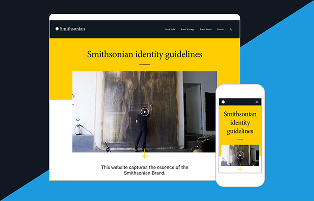
Fisk Studio is behind the Smithsonian’s latest re-branding, which made subtle changes to their logo and dropped “Institution” from their name. The creative agency, which also did the official identity guidelines site, has a great case study about it on their website.
![]()
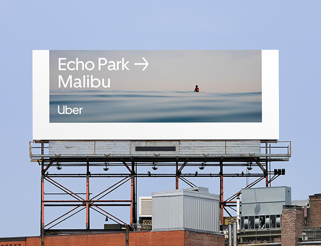
The ride-sharing service recently re-branded, pivoting away from their recent “U” logo and using the shape instead as a sort of mask element for a variety of on-point layouts. It’s certainly a great technique for keeping the “U” without having to use just the single letter as the logo mark.
![]()
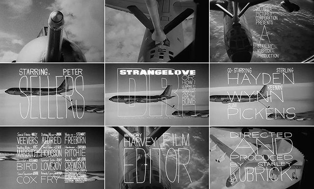
Titles designer Pablo Ferro passed away earlier in November. He was best known for the title sequences for Dr. Strangelove and Bullitt. Art of the Title has a multi-part write-up on him, and also was fortunate enough to interview him. It was uncanny at the time for full-screen text titles, plus a production that would embrace thin handwriting to boot.

Got something to add?