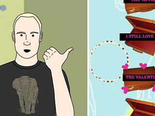
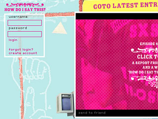
 Interview with “How Do I Say This?” site creator, Aaron Koblin, on collaboration, challenges and getting people intelligently engaged.
Your background is in design, data architecture and gaming. Can you tell me a little more about yourself, your approach and your influences?
Aaron Koblin Well, I’m probably more artist than designer… or at least designer in the broadest sense of the word. I received my MFA from UCLA’s department of Design | Media Arts and have since been working on a number of data-driven projects. I’ve become interested in creating systems to deal with large amounts of data, particularly human data. That is to say information about culture and humanity. I suppose I’m an odd mix of techno-dork and social tinkerer.
This project, which started as a contest with MTV, just won an award at the SXSW festival. What has been the emotional ride since the first idea came your way?
AK The whole thing was rather exciting. It’s not everyday that someone gives you cash and says “make something fun.” It was great having the opportunity to work with some really talented people and throw a bunch of ideas around. At times I think we were all skeptical of certain aspects, but working with each other we learned a lot and pulled everything together rather well.
How was your collaboration with filmmakers David Harris and Dagmar Weaver-Madsen?
AK The project was really David’s creation. His imagination, combined with Dagmar’s enthusiasm and attitude really made the project come together. They can’t be given enough credit for kicking everything into high gear and making things materialize the way they needed to.
 What were some of the challenges you faced for constructing a rich media site like this?
AK The usual issues were there of course, designing for a wide range of machines and users. We decided to go almost entirely Flash and this helped to standardize the experience a bit. We were trying some relatively hacked technologies with this site. Using the new bitmap access features of Flash 8 to save user drawings and icons, and the interface itself as well as the user account system were rather hacked together (luckily no one is examining my code ;) ). The beauty of these systems though is that its really just an infrastructure, ultimately it’s the users who really make it a rich experience.
The user-centric, experimental site: can you explain if this is something that’s come to be expected for a viral campaign, having people sign up to “play?”
AKI think it has come to be rather expected. That’s not to say that I think it’s necessary, or even the right approach. Account driven systems have some major advantages. I think there are reasons why this method is desirable and logical, but I’m working on another project right now which takes an alternative direction… I’m not sure that the “sign-up” methodology needs to be the core of a good user-centric site. I always say the less overhead for the end-user the better, of course there needs to be a balance, and assuring the quality of the content is paramount in these systems.
What expectations were met — or not — after launching the project?
AK Personally, I wanted to make a site that worked. I believe we succeeded in that regard. I think David and I both had ideas about ways to take the interaction further and I believe we could have dramatically boosted the viral nature of the project. Given the practical constraints we were dealing with though, I’m happy with our creation.
It was interesting to me to see you’ve done several conceptual web projects — commercial work like Sprite and personal work like The Sheep Market — and taught a class in game design on the web. Where do you see yourself going next or will you continue to explore similar work like with Processing and Flash?
AK Yes, I’ve been all over the place, and I intend to keep it that way! I’m currently working with Yahoo! in a group called Design Innovation. It’s great and I’m sure some of the things I’m working on will soon be public (and fun to talk about). I will also continue working independently on art and design projects. I guess my highest priority is making systems that get people intelligently engaged in new and unique ways.
Overall, what do you think is going to be the next big step forward in user-centric web sites?
AK Well, if I’ve learned anything it’s that users like things to be done for them, but not without their knowledge. On the practical side of things, systems that can take advantage of the wealth of existing knowledge from other popular services online and create fusions and intersections between such services will have and obvious draw. Anything that can pull people away from MySpace in large clusters will be a good thing. I think in general designers of these systems need to think more specifically (and creatively) about incentive systems and how to clarify and solidify rewards.
Thank you for your time!


Commentary
Got something to add?