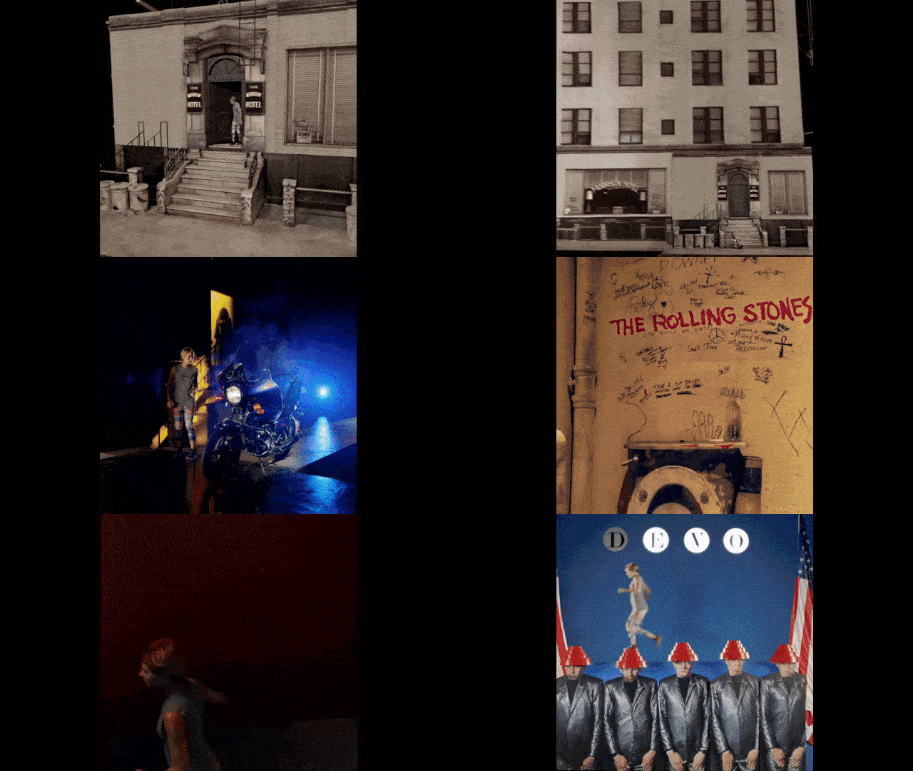
Music video director Michel Gondry helmed this month’s album cover ad for Pandora, marking their start to a #SoundsLikeYou campaign. Partizan did the production. It’s a great example at keeping your attention in little vignettes: what album cover is next and how’s the person going to run through it. Funny too how online now we have a 1:1 aspect ratio trend — a throwback to the square record cover.
![]()
Smashing Magazine shares 16 points on how website form design is better if you have one thing per page. This bucks the trend of having as much as you can now on a single page. The difference in this case is about segmenting complex processes into smaller pieces.
![]()
Milwaukee Ballet has a website that garnered a 2017 Webby nomination. BFK made it for them. The use of background video and untraditional navigation stands out from the crowd.


Got something to add?