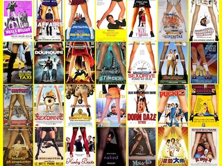
Legs stand for raunch-factor
French distributor Christophe Courtois has compiled a photo blog of film posters sorted by red, blue, and black trends to highlight some of the cliches — or visual indicators — of marketing studio and independent feature films. Check out all of his posts or take a look at these three to start:
- Revealing a face using other film details
- Portraits with overlaid typography
- Yellow must mean an independent film
(via Flavorwire via designer Stefani Manger)


Got something to add?