- Published in Web
1. Linear lock-down
Problem: Start at the beginning. No user-empowerment. No “chapter skip,” even if there isn’t a splash animation. No persistent mute button. Frustration ensues.
Solution: You could break your Flash site into different chapters. You could use conventional approaches, like contrast and mouse-overs. You could put links to everything up-front. You could use Flash’s shared objects to store a preference for each visitor. This is a good place to use a flow chart if you’re the designer. Nothing concrete, more like a general description of each “page” or “user stop”, with lines mapping out expected, or forced, navigation to the next page(s). This also is irreplaceable when it comes to later versions.
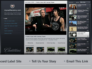
Example: mycadillacstory.com, a video site for brand enthusiasts to share their experiences, allows you to “Email This Link” for individual videos, so you can easily return to specific parts of the all-Flash site. “Permalinks” (jargon for permanent links) also help with tracking visits and returning to a page after it falls off a front page. (Site by Modernista.)
2. Super-unusable uses
Problem: Web browser only, no “back” button, no print, no deep bookmark. HTML sites set up some rules and expectations, which help people judge a site’s efficiency in getting where they want.
Solution: On the heels of linear control, you could bring them into different HTML pages. This helps with going “back” and pulling up bookmarks. You could even offer up the print option if your content is laid out separately and piped into Flash with text files or a database.
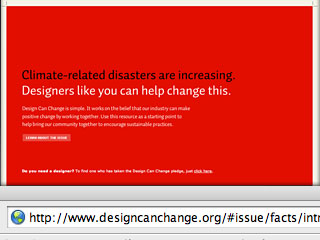
Example: Design Can Change, a recently-created site encouraging sustainable design, uses special addresses like “…/#resources/facts/intro” for getting around with ease. (Site by smashLAB.)

3. Search engines? I don’t need no stinkin’ search engines.
Problem: Finds page one. No deep links. No keywords. Even small HTML sites can be found through the “back door,” finding your relevant content first, rather than go through the front door.
Solution: Along with control benefits, you could tag deeper pages, but you’re still missing the bonus points of contextual relevance. Optimize as many pages (HTML) as you need with routing to that frame/chapter/file. And test drive with “swf2html” in Adobe’s Flash Developer Kit.
Example: AIGA Design Archives, an expansive and updated directory of jury-selected design work, has simply titled pages for every item, so searching for “Seven main titles” — to piggy-back on our recent film titles post — finds entry #2615. (Site by Second Story and thirdwave.)
Note: In March 2007, 40% of traffic to FWDlabs.com were organic referrals, or visitors coming from (often very specific) Google searches.
4. Load, cache and two smokin’ versions
Problem: You’ve got to be careful to pre-load, auto-refresh the cache, and consider a lo-fi version, which can get out of date or miss the sell.
Solution: You could load files within files to save yourself and your visitors some time. You could use Flash ActionScript for randomly generated numbers, tag-teamed with an HTML no-cache reference. You could run your site off a CMS (content management system) to auto-generate two versions at once.
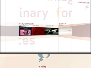
Example: Imaginary Forces, who updated their reel in March 2007, has multiple “loading” loops while going across the site, but runs out of one container – a single Flash file.
5. Build now, update later, right?
Problem: Once you’re set, how quick can you update? This is the number one problem with building first, asking questions last. Most Flash sites are static, like an informational kiosk, or map out their information architecture to plan for growth. It’s also a common problem with inexperienced software developers.
Solution: You could build your Flash site with a plan to grow, where it’s not stuck behind hours of update steps and instead ready to run right beside you. Text and links are easiest to update. Images and video are trickier. User interface elements like navigation can be trickiest. This is another good place for a simple flow chart. Break down by area, function, etc. using a “now, next, later” analogy.
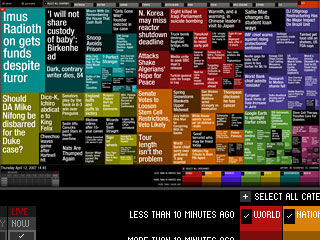
Example: Newsmap, which changes based on algorithms to judge the recency and repetition of news headlines, is designed to update automatically. (Site by Marcos Weskamp.)
More in Web
On deck with some established artists linked on FWD:labs will be more dynamic web sites running off our app, some which may choose to have Flash here and there or everywhere. All will be brandable to the user’s taste. This will be a premium feature.
Special thanks to Joe Carlson for editing assistance.

Commenting on this post is now closed. Please contact us if you have any questions, comments, concerns or ideas.