DreamWorks Animation’s TURBO
Any artist at a large entertainment studio will tell you that it is rare for an individual artist to get to take ownership of their particular contribution to a project. Usually the work you do is one of many steps in a robust pipeline, and once the product is completed, so many different artists and departments have touched your section of the project that it can be hard to discern what you’ve done. However, sometimes opportunities come along that allow you to work outside the pipeline and try something new. I feel extremely honored and fortunate to have been given such an opportunity at DreamWorks Animation on the film Turbo, as a Visual Development and Motion Graphics artist.
Joining The Team
When I was first approached with the task of helping produce motion graphics sequences for Turbo, I was working on the film already as a Final Layout Artist. I had worked in 2D graphic-animation at the studio before on two previous projects, so I was on a short list of artists with design backgrounds who also knew the tools and how they could be integrated into the main pipeline. Normally, DreamWorks has a dedicated team they call upon to help tackle such rare instances, but the entire team was already occupied on other shows in production, and since I was already on the Turbo payroll it would be an easy transition to jump over to the Art Department.
For several weeks, I split my time between Final Layout work and Motion Graphics work. However, once it became clear that there was an intense amount of work to be done, I became a full-time Motion Graphics artist for the show, essentially becoming a one-man operation under the umbrella of the Art Department. I had the pleasure of working with the very talented Production Designer Michael Isaak and Art Director Richard Daskas, as well as Visual Effects Supervisor Sean Phillips. These great leaders, with the help of other talented artists I’ll mention below, gave me the chance to create the most satisfying work I’ve ever done in my Feature Animation career.
The Tomato Race
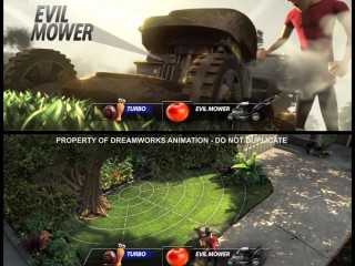
The first sequence I received was “Tomato Race”, in which an overzealous Turbo decides to race a dangerous “Evil” Lawnmower to a ripe Tomato that fell out into the yard. Director David Soren and the story team dreamed up a visual approach in which Turbo envisions the world as a video game, complete with data visualizations and a heads up display. Visual Development artist Margaret Wuller had already done a pass designing the HUD, which would feature speed “power bars” and avatars. I was asked to design a tech-looking data visualization to represent distance and target. Michael Isaak mentioned the motion graphics from Stranger than Fiction as a point of reference. In the end I provided high-res 2D plates for compositing, and a 4K-sized texture map that surfacing overlaid onto the grass. Below is a series of images that show the solutions we ended up with. (Jump to video reel.)
Fast Logo
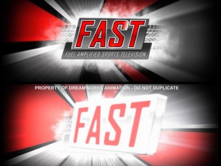
The fictitious world of Turbo features a faux sports network where the races are broadcast, Fuel Amplified Sports Television, or FAST. During story revisions, a visual beat featuring the FAST network logo was added to stitch two sequences together. I was asked to come up with a moment of high-energy animation to act as the network logo before jumping into the post-race coverage. Visual Development artist Daniel Hashimoto had already designed a great FAST logo with some slick animation, so I was able to borrow what he had done, and transform it into a faux-3D version that could fly in, and wipe the screen when finished. All these elements I then comped over an animated starburst-like design that I based on the logo colors, and then added a bunch of smoke and burnout effects to spice it up and keep the animation alive. (Jump to video reel.)
Cell Phone Graphics
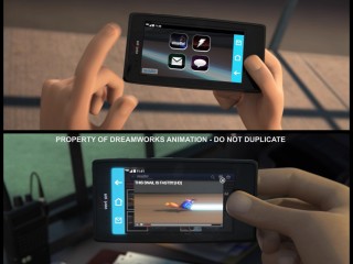
At one point, a teenage kid takes video of Turbo and uploads it to an online video site, setting into motion a viral video sensation. For these shots, we had to create simulated phone-usage graphics that would feature a proprietary video-share application, as well as e-mail and video-browsing. On the design side, myself and Craig Church took a shot at designing an interface, icons, and browser that was a hybrid between Android-like interface, iPhone-like icons, YouTube-like video browsing, and our partners own video application Viewdini. I ended up downloading the real Viewdini to my own smartphone to study how the application communicated its information. Ultimately I wanted to caricature all these ideas into the most simple read possible. Images below demonstrate our collective solution. (Jump to video reel.)
Viral Video
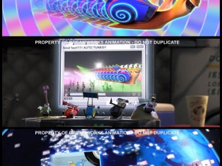
The cell phone sequence quickly gives way to a crazy viral video sequence, featuring comedic video remixes and a stylistic shot representing the videos traveling the globe. For the viral video, we looked at lots of psychedelic music videos like De-Lite’s Groove is in the Heart, and Zlad’s Elektronik Supersonik for inspiration. In the end, Michael Isaak designed a pastel rainbow radial pattern, which I then animated, and lighting department executed the “echo” effect. Craig Church and myself also did some laptop graphics to provide the invisible transition between the cellphones and the Taco Stand location
The globe shot was one of the biggest challenges we tackled, both because of the sheer amount of visual assets required to finish it, and because it was all done outside of pipeline. Michael and Rich were extremely generous in letting me blue sky several concepts for how the shot should look. I pitched them the concept of screens literally orbiting around a stylized planet, while continents built from tiny screens lit up as the Earth turned. Unfortunately I cannot show the many iterations we went through in this article due to legal restrictions, but I can describe the process a bit.
Early versions I designed looked like an Apple advert, very whitespace backgrounds with a light evenly-lit sphere as the planet, and bright pastel colors representing the screens. Ultimately we arrived at something that resembled outer space, and we abandoned a hyper-stylized Earth for something more satellite-image based. Rich Daskas created a painting which I used for lighting reference, and the final execution was done completely as a 3D-fake in After Effects, using a proprietary method to generate stereoscopic 3D effects, and leaving space for lighting department to drop in the animation screens that sync up to the globe background. The shot took almost 4 months from start to finish, and we were very happy to mark it final in dailies.
JumboTron Lap Graphics
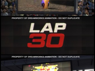
Story department had drawn up panels in Act 3 of large jumbotrons displaying which lap the race was currently on. I was asked to translate these ideas into broadcast graphics that surfacing could use for those shots in the movie. Again, Mike and Rich gave me pretty creative reign, and asked I just keep it very simple. I ended up creating a large assortment of options based on some visuals that Previz had done featuring large white and red text. The concept I went for was somewhere between slick ESPN-style motion graphics, and cheap sports-arena animations. Naturally, the options ranged from flying 3D elements, to spinning text, to shattering graphic elements. Ultimately, Soren chose three of the options to use in key lap-shots. (Jump to video reel.)
While creating these graphics, I also wanted to incorporate the look of a worn-down jumbotron bulb-grid. I looked at various videos of the actual jumbotrons used at the Indy 500 track and studied the matrix patterns they divide the bulbs into. Using a multitude of filters, blends, and plug-ins, I was able to come up with something that looked pretty convincing. As an experiment, I tried running some finished lighting-shots through the filter and presented it to Soren to see if he liked it. Fortunately, he liked it so much, he asked me to run all of the jumbotron footage shots through my filter. In the end, I was asked to tone down the effect quite a bit, as I had incorporated details such as dead pixel-blocks and faded color zones, and it proved to be too distracting in many shots. However, on the third image below, you can see the unaltered jumbo-fade effect.
The SuperStove
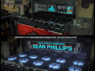
One of the most fun things I was asked to design was a gag we referred to as “SuperStove”. The story beat called for an over-the-top futuristic stove that could talk, and Mike and Rich once again let me go wild with anything I could think of. Previz had mocked up a version that suggested a blue/orange color scheme, and some equalizer bars to add visual cue to the speech. Building upon that, I then looked at future-tech HUD inspiration like Tron and Iron Man, mostly for motion ideas. To keep with the theme of the movie, I tried to incorporate elements of sports car HUD, and automotive-inspired shapes like speedometers and fuel indicators.
Bringing all that together, we ended up with a very busy-looking tech interface, the goal being that there is so much happening, you wouldn’t actually try to read any individual piece. Not forgetting the point of the whole shot, the centerpiece featured 10 propane indicators that double as equalizer audio bars, which I animated to the voice performance. The Art team and Soren were pleased enough with the result that they let me reprise the gag for one of the title cards in the end credits.
Pixelation graphics
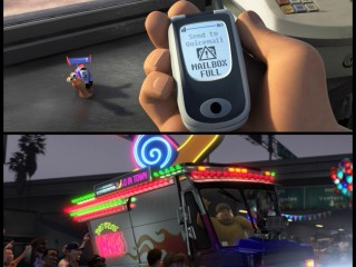
Another fun area that I got to touch was a handful of 8-bit / LCD graphic displays. Craig Church and Margaret Wuller designed some great graphics for cell phones and scrolling marquees that I was able to build upon. For Tito’s cell phone, I wanted to imitate the feeling of circa late 90s slow-refresh displays. I ended up acquiring video of old Nokia bar phones, and studying them frame-by-frame to get the refresh-speed just right. The result hopefully will remind some people of their pre-smartphone days.
One of the final pieces I got to design was the marquee on the side of Tito’s supertruck. When developing the look of the supertruck, Wuller had written the phrase “The Fastest Taco in Town” on the marquee as a placeholder, which seemed perfect to me. In Los Angeles there is no shortage of taco trucks parked around town, so I had plenty of inspiration to draw from. Ultimately, in the interest of simplicity, I designed an 8-bit looking Turbo that could zip across the text and wipe it clean, before sliding it back into place. It was surprisingly challenging trying to animate the words and graphics into a very regimented matrix grid of bulbs, while keeping the color palette as limited as possible. The result can be seen below in the video.
Working in the Art department on Turbo is easily one of the most satisfying moments of my professional creative career to date. It is one of the rare times where my job allows me to execute while being educated. The team was extremely supportive, super positive, and collaborative to a degree I’ve never experienced before.
At the premiere of the film, our director David Soren got up to say a few words to the crew before we all watched the fruits of our labor. He said, “We had a lot of fun making this movie, and all of that energy can be seen up on the screen”. I don’t think I can say it any better than that.
[vimeo]http://vimeo.com/71488088[/vimeo]
(Originally posted at badgerart.blogspot.com.)


Commentary
Got something to add?