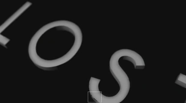
Namaste, LOST watchers. The final episode airs this Sunday, and soon we will have to bid Aloha to our favorite headache-inducing show of questions and no answers. Before this whole thing comes to The End, however, there is one mysterious visual element worth discussing that I find more confusing than the island itself. This:

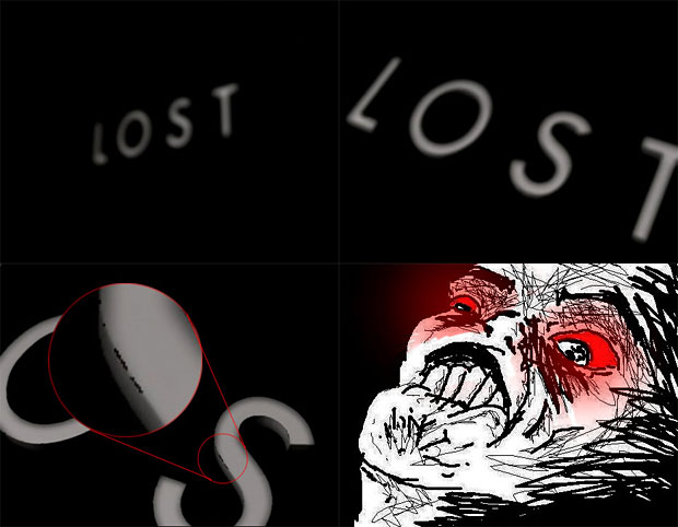
The LOST opening titles, and their simplicity. Now, there is certainly something to be said about the minimalist quality of the titles being a fitting intro to a show whose hook is all about mystery, and often completely devoid of answers. It provides little visual information, giving us nothing to read into, and further just lets the viewer fill in the many blanks that the show has created over time. The rudimentary nature of the titles I don’t have a problem with, but the rudimentary execution is what is boggling. The titles are just the word “LOST” rendered dimensionally, tumbling towards us in space through a very tight focal plane, meaning it appears out of focus as it approaches, and for a brief second comes into view before going soft again. Yet in this moment, we catch a glimpse of a horribly aliased, confusingly shaded amateur-grade graphic complete with artifacted edges. Most viewers probably don’t even notice, but there is no doubt a large enough population of baffled fans, enough to prompt internet commentary such as this:

Honestly, how does a show that has become the most popular serial series on television have a title that looks like it was the result of some student graphics class tutorial. A few ideas come to mind, but my primary theory is the fact that J.J Abrams has a history of giving a personal DIY touch to the titles of his shows. Before LOST, Abrams had created two other series, Felicity and Alias, both of which he decided to compose the title theme music himself, and in both cases it stuck straight through until the series completion. LOST is no exception, Abrams having composed the title theme again which remains the same today. It’s possible that he thought it might be fun to go one step farther in this case and actually design and animate the opening graphics to accompany his music.
It’s also possible that Abrams has little experience with graphics software, or was struggling to achieve the appropriate look he wanted. If the 3D titles were done in a comp software with a non-native plug-in of some sort, Abrams probably was attempting to tweak the raw output of the extension, to get something closer to his vision. However, the wrong mix of sharpening, minimize/maximize operations, and ramping blur animation will result in edge-artifacting very similar to the moment we see in the titles. The aliasing of the words, the odd soft-edges of the letter shading, and of course the artifacts themselves, make me think this was likely the case. Of course it is also possible that they just hired a lowest-bidding title company to slam out a quick rendition of the titles for approval, and somehow those made it to air, but for a pilot that cost between 10 and 14 million to make, it seems likely they would spring the extra cash to get a quality title.
The frustrating LOST title is likely the consequence of a tradition that Abrams, and perhaps many series creators and show runners, has adhered to. I’m sure there is a bit of fun and excitement for any series creator or creative head to place their personal mark on their baby before sending it out into the world, even if it means the sacrifice of quality and polish. His tradition continues in Fringe, to which he once again composed the title theme. Yet maybe after his LOST title debacle, he’s decided to get out of the pro-hobbyist graphic design business.
UPDATE: Art of the Title Sequence had an article about this subject, and confirmed that it was indeed made by Abrams himself on a laptop and After Effects.
(Originally published on A Stack Of Drawings.)


Got something to add?