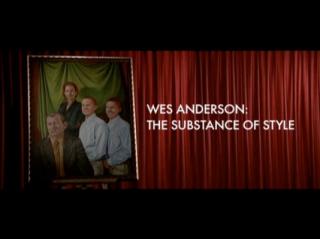
Moving Image Source, a web project from the Museum of the Moving Image, posted the final installment of “The Substance of Style,” a 5-part video essay analyzing Wes Anderson’s key influences.
Focused on “the alchemy of creation,” author/narrator/editor Matt Zoller Seitz breaks it down:
- Part 1: Bill Melendez (“wisdom and naivete of Charlie Brown”), Orson Welles (“decline and failure … dynamic and often flamboyant visuals”), and François Truffaut (“fascination with childhood and it’s persistence in adulthood”)
- Part 2: Martin Scorsese (“slo-mo to italicize … God’s-eye-view insert shot … whip pans that split the difference between first person and third”), Richard Lester (“buoyant, engaged editing”), and Mike Nichols (“generic structure with nearly unlimited emotional range”)
- Part 3: Hal Ashby (“ability to jump from genre to genre with impunity and to make almost any situation seem perfectly natural”)
- Part 4: J.D. Salinger (“self-aggrandizing lost soul … neurotic, depressive, hyperachieving”)
- Part 5: Prologue to The Royal Tenenbaums, annotated
Related, check out the director’s consistent use of the typeface Futura, created by Paul Renner in 1928 and widely used in the 1960’s. Not just in most of his film’s opening titles but also throughout the art direction, which typographer Mark Simonson notes in screenshot form. Director Stanley Kubrick was also a fan of the font.
(via Jason Kottke)


Commentary
Got something to add?